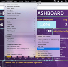
HR Analytics Interactive Dashboard - Tableau Project
PROJECTS
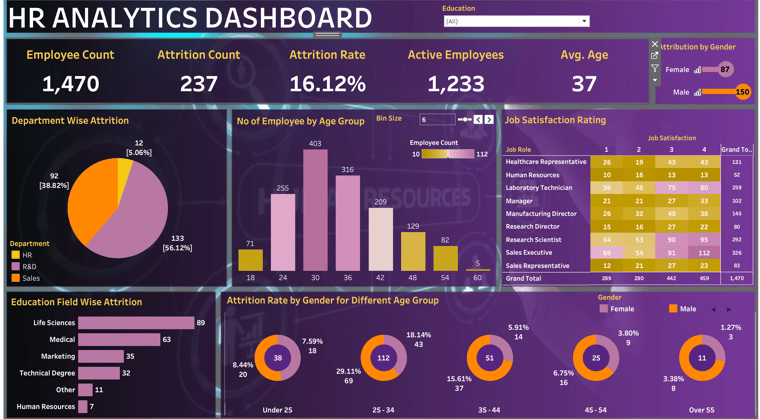
Our comprehensive dashboard project leverages Tableau's dynamic capabilities to visualize key HR metrics such as headcount, employee activity, and attrition rates. From straightforward Key Performance Indicators (KPIs) like total employee count to nuanced analyses of attrition rates by gender and department, each component is meticulously crafted using interactive lollipop charts, pie charts, donut charts, among others. The dashboard design, featuring a custom-sized floating layout, ensures an aesthetic and user-friendly experience.
If you want to practice Tableau following this tutorial, access dataset:
Project Overview
Creating a comprehensive overview of essential HR metrics, this project employs data visualization techniques to explore crucial aspects such as total headcount, active employees, and attrition rates.
By leveraging data insights, the dashboard facilitates a deeper understanding of workforce dynamics, aiding HR teams in strategic decision-making and proactive planning for growth and employee retention.
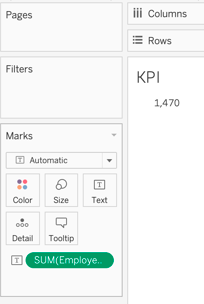
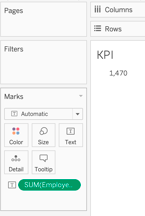
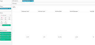
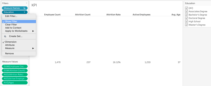
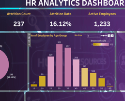
Chart 1: KPI (Key Performance Indicators)
1.A. Employee Count
Sum of all employees.
If you like this content and want to learn more, you might also read:
SQL Fundamentals for Data Analysis: A Hands-On Learning Series
Essential Technical Skills for Data Analysts
Transforming Data Into Insights
The Power of Data Visualization Tools: A Visual Journey through Insights
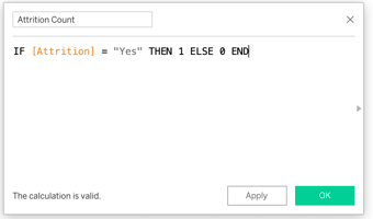
1.B. Attribution Analysis
Place intocolumn “Attrition”:
YES: Employee has left the company.
NO: Employee still working in the company.
Let’s see how many people have left the company by counting the amount of “YES” and “NO” by assigning the number “1” for “YES”; and “0” for “NO”.
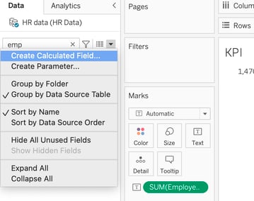
To do that, we will write our first calculation field.
Then, we write the equation:
IF [Attrition] = "Yes" THEN 1 ELSE 0 END
It was a short and very simple overview of Tableau Dashboard project based on Data Tutotials.
To see the final real time dashboard, check out my Tableau Public profile HERE.

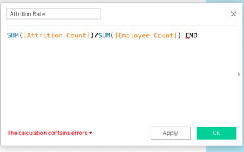
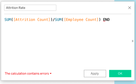
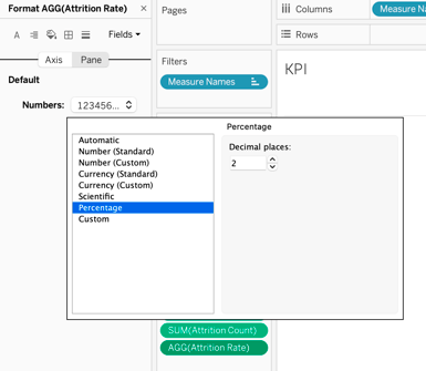
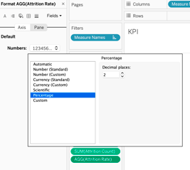
Now, we want to find the attrition rate, which is the form of percentage, by writing a new calculation field:
SUM([Attrition Count])/SUM([Employee Count])
After, we need to change its format to “percentage”, equaling to 16.12%.
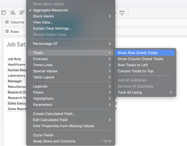
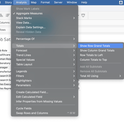
Add a grand total by clicking on “analysis” -> “totals” -> “Show Rows Grand Totals”.
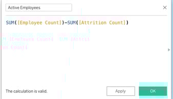
For active working employees, we calculate:
SUM([Employee Count])-SUM([Attrition Count])

We also are adding “[ ]” to “percentage of total” and formatting labels.
We also include the average age to our “measures Values”.
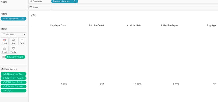
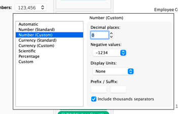
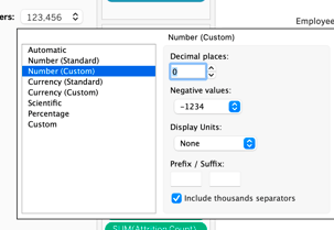
To maintain the interactive dashboard with the same format when we are filtering, we must keep the unit format decimal as “0” for all whole numbers.
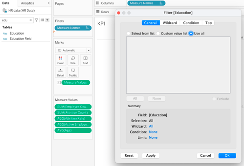
Now, we want to add “Education” to “Filters”, clicking “use all”.

For the second instance, we mark it as “circle”.
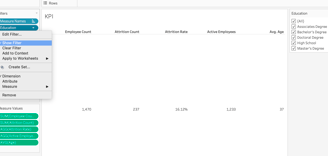
Then, “show filters” to visualize all education options.
To finalize, let’s “Apply to Worksheets” -> “All Using This Data Source”, that means that whenever we design any further sheet in coming time, the default filter will be automatically applied.
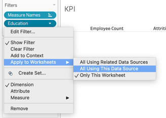
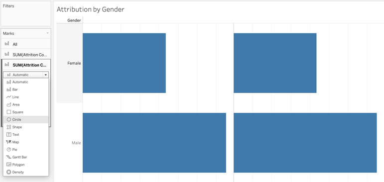
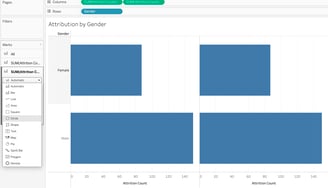
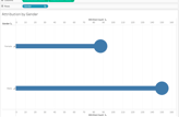
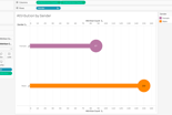
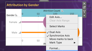
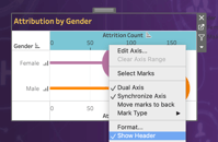
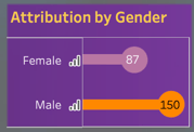
Chart 2: Attribution by Gender (Lollipop Chart)
This is a custom chart to gives us insights about gender such as how many female/male are leaving the company.
To start, we place “Gender” into “Rows” and “Attrition Count” into “Columns”, as a bar chart.
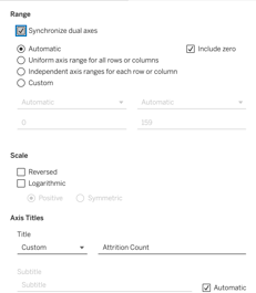
Now, we want to make it as custom which is a lollipop chart. For that, we have to make it as dual access chart.
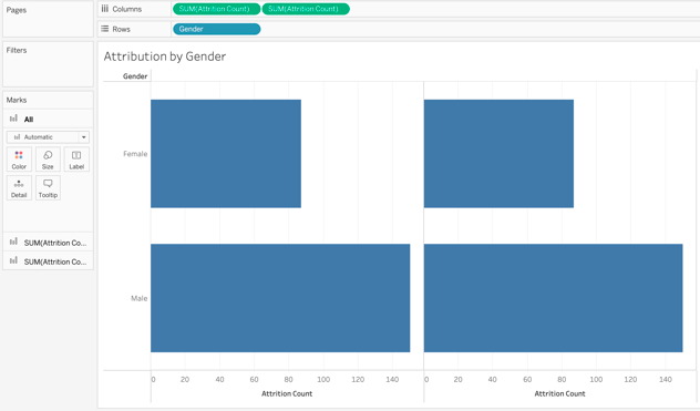
Next, we mark it as “dual axis”.
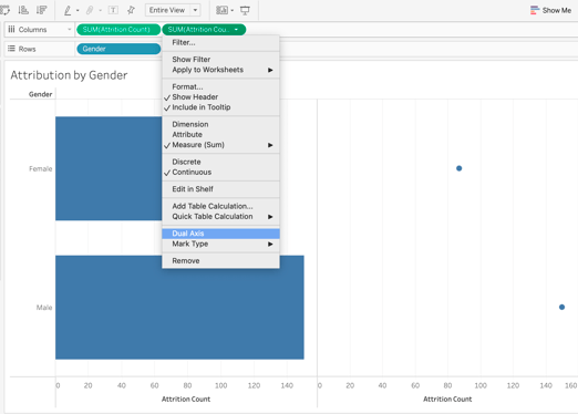
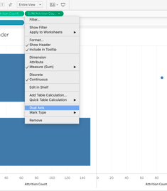
Then, we check “Synchronize Dual Axis”, so they are using the same measure. We want to do it whenever we are working on a dual axis chart to synchronize them.
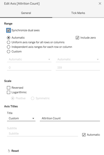
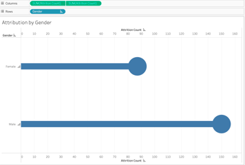
Now, let’s fix the size of chart and circle to look like a lollipop chart.
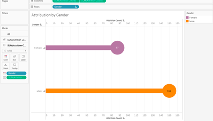
Some other customizations to the second/circle instance are: color and label genders.
Here is how this chart looks like:
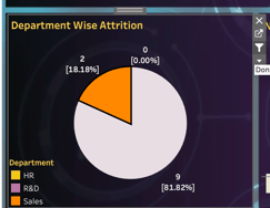
Chart 3: Department Wise Attrition (Pie Chart)
Let’s start placing “department” to “color” and changing it to pie chart. Then, “entire view”, for a better visualization.
As right now, pie chart is split equally. We want to place “attrition count” into “angle” to show the correct proportion of each department. You can format color, labels… according to your preference.
We are labeling “attrition count” and changing it to “percentage of total” and labeling the whole number.
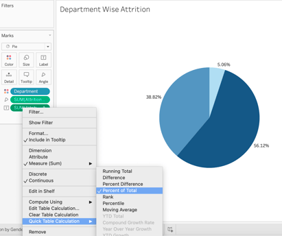
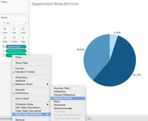
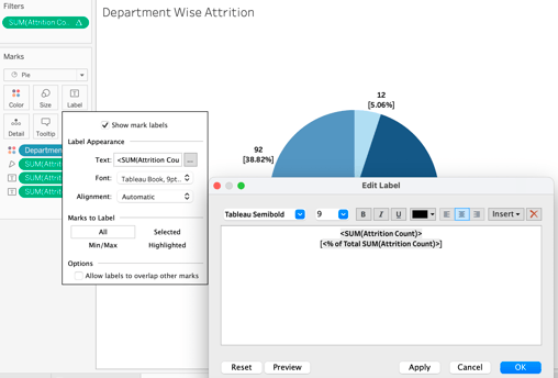
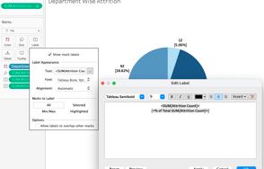
NOTE: You might want to change to white color for dashboard.
Chart 4: Number of Employee by Age Group (Frequency Chart)
In this chart we can see the total number of employees, indicating the sum of workers per age range.
We first create a “bin” for “age” to generate the range. For “size of bins”, let’s change it to “Create a New Parameter”, and fix “name”, and “Range values”.
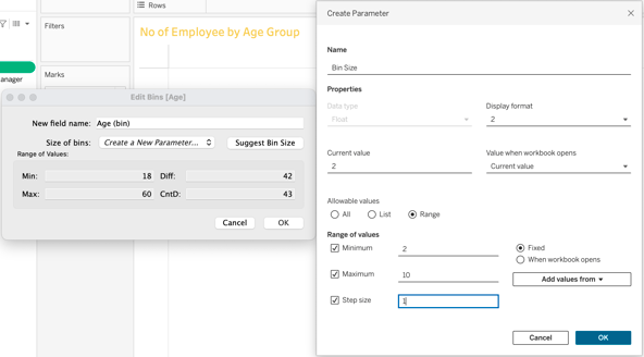
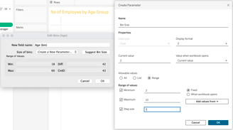
Place “Bin Size” and place into columns. Then, “Employee Count” into rows. Below, image of the chart already edited.
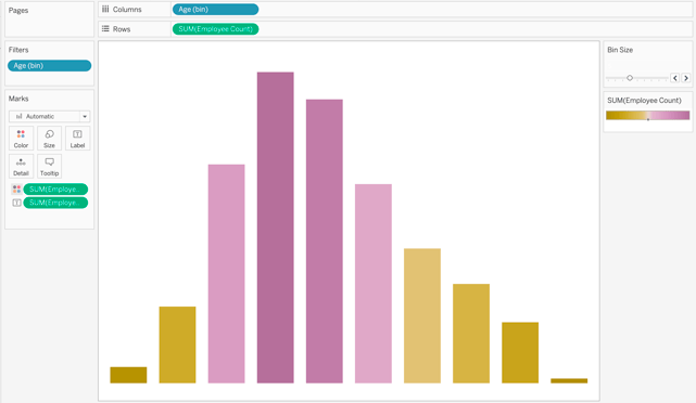
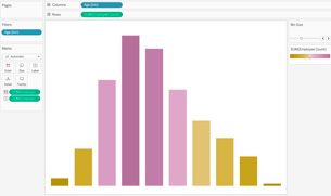
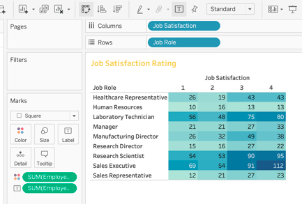
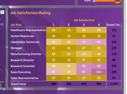
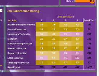
Chart 5: Job Satisfaction Rating (Matrix Chart)
Here, we are creating a chart with the rating of satisfaction of the employees, where 1 is the lowest and 4 is the highest satisfaction.
We place “Job Role” into rows and “Job Satisfaction” into columns.
However, we want to use numbers to rate satisfaction, so we drag it into “Tables”, then we move it to columns.
Next, let’s take “Employee Count” into the “Text”.
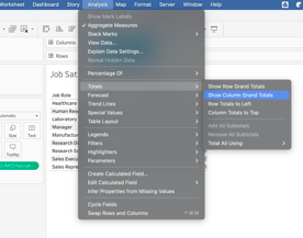
Now, add a grand total by clicking on “analysis” -> “totals” -> “Show Columns Grand Totals”.

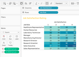
For formatting, let’s do a “Heat Map”, then swap the rows to maintain this format.
Below, the final chart after formatting colors, fonts, etc.
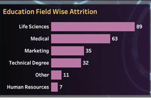
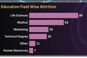
Graph 6: Education Field Wise Attrition (Bar Chart)
To start, let’s take “Education Fields” into rows and “Attrition Count” into the columns, then format as desired with labels, colors, you decide.
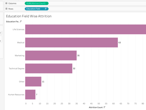
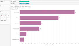
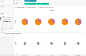
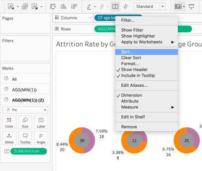
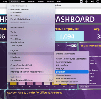
Chart 7: Attrition Rate by Gender for Different Age Group (Donut Charts)
In this multiple donut charts, we are showing how many people are quitting their jobs.
To start, let’s place “CF Age Band” into the columns and change the marks as pie charts, “Gender” into “colors”, and “Attrition Count” into “Angle”.
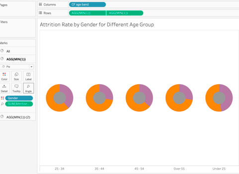
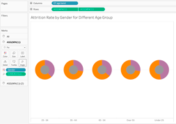
To make them donut charts, we create in rows MIN(1) twice.

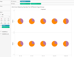
For the second axis, let’s remove “gender” and “SUM(attrition count)”, make the size smaller.
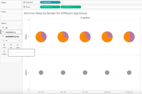
Then, make it a “dual axis”. You can adjust sizes for the donut charts, color will be created by default from gender used before, and you can remove axis and labels for columns.
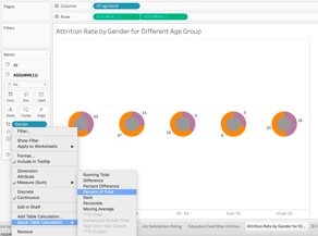
Let’s create labels -> “Quick Table Calculation” -> “Percent of Total”.
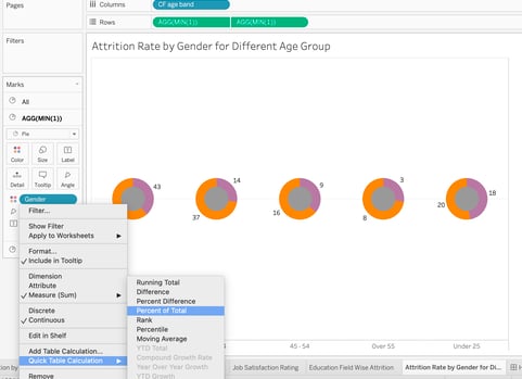
Next, let’s create KPIs indicating a total number by placing “Attribution Count” into labels (second axis).
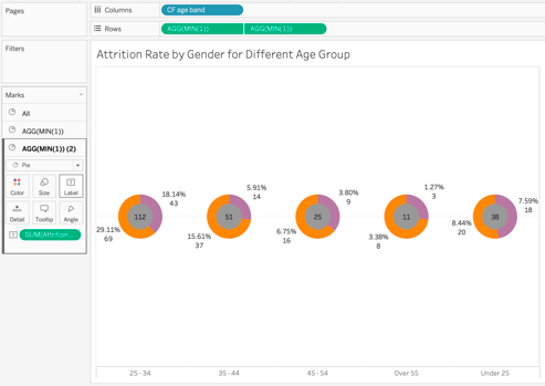
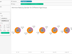
To fix age band to the proper format, under 25 first, right click on “CF age” (column) -> “sort -> “Manual” to manually arrange the sequence.
Building Interactive Dashboard in Tableau
To start organizing our dashboard, let’s custom size: 1580 x 900. Totally up to you the size you want to use upon your resolution.
If you want to use a background image, you can customize wallpapers from PowerPoint, and save as PNG format.
Download background HERE. Choose one template.
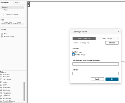
To download it into the dashboard, go to “Objects” -> “Image”, then check “Fit Image” and “Center Image” -> “Choose”.
For this project, we are using “Floating” layout instead of “Tiled”.
In Tableau dashboards, the key difference between floating and tiled layouts lies in how objects are arranged:
Tiled Layout in Tableau:
All objects are organized in a grid-like hierarchy on a single layer.
Objects in a tiled layout do not overlap, forming part of a grid that resizes based on the overall dashboard size.
Tiled layouts ensure visibility and accessibility, maintaining a structured appearance.
Floating Layout in Tableau:
Objects in a floating layout can be layered on top of each other and may have a fixed size and position.
Floating objects offer more flexibility as they can overlap and be positioned freely on the dashboard.
When using floating objects, you have the option to adjust the height and width as needed.
Considerations for choosing between the two depend on your specific design needs and preferences. Performance tests have shown that floating dashboards may work faster.
Now, let’s adjust KPI chart on the top part of the layout hiding filter and header.
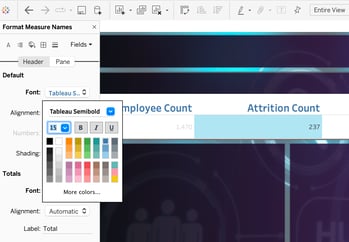
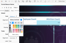
You can choose colour, font, and alignment.
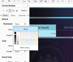
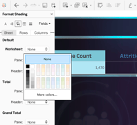
We use “Format Shading” -> “none” for no background.
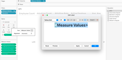
To format the numbers, we go back to KPI worksheet -> “Text” to open the format window.
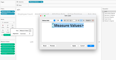
Let’s hide top and bottom “Attrition Count” headers.
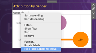
For “Gender” heading, we also hide it.
Then, we want to adjust it to fit into to the dashboard layout. Adjust sizes and colours according to your preference to fit it properly. Also, you can mark “Lines” as “none” in all to hide them.

To add the dashboard title, simple use the “Text” from “Objects” and adjust in the title layout area.
Next, let’s place “Department Wise Attrition” using the same steps of adjusting size, “format” -> “shading”
-> “none” for background. In this case, we want to keep filter and format.
Let’s place “No of Employee by Age Group” chart next, editing like other charts.

Time to place “Education Field Wise Attrition” chart to dashboard, using the same steps for fitting and formatting according to your preference.
Finally, we are fixing the last “Attrition Rate by Gender for Different Age Group” donut charts into the dashboard.
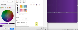
To match the middle of the donut color with the background, open background on PowerPoint and select color to put into donut format.

Lastly, for filtering, we click on any of the charts -> “Analysis” -> “Filter” -> choose filter, in this case “Education”.
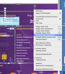
To make it a dropdown, double click -> “Multiple Values (dropdown)”.
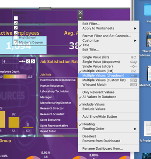
As you are done, play around with the dropdown and you’ll see the charts changing accordingly.
If you click on “Department Wise Attrition” chart, you will see that other charts are not changing accordingly. To fix that, click on the filter icon to create the action. Do the same to all charts if needed.

Final dashboard: